Decompose what free shipping actually costs by comparing what customers paid against what carriers charged. This playbook finds the value bands where margin covers shipping and where it doesn't, replacing guesswork with a data-driven threshold.
Most Shopify stores set a free shipping threshold and never look at it again. The threshold does its job. Customers add items to hit it, AOV goes up, everyone's happy. But nobody tracks what happens on the other side: what the carrier actually charged to ship those orders.
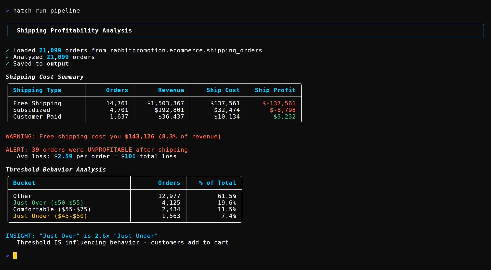
This playbook builds a per-order shipping P&L. It compares what was charged to the customer against what was paid to the carrier, then maps that gap against product margin. The output is a profitability score for every order, broken down by shipping type: free, subsidized, or customer-paid.
hatch run pipeline | claude -p "what should our free shipping threshold be?"
Running the Playbook
The pipeline processes order data with shipping costs, calculates per-order profitability, and analyzes cart behavior around the free shipping threshold. After cloning the repo (with Claude Code/OpenCode or without) you get the following package:
cd playbooks/shipping-profitability
hatch run pipeline
Or connect to BigQuery by setting credentials in .env:
hatch run pipeline --source bigquery
How It Works
Each order gets three calculations: gross margin (subtotal minus COGS), shipping profit (what was charged minus what was paid), and net margin after discounts. Then the pipeline categorizes shipping type (free, subsidized, or customer-paid) and classifies each order as unprofitable, marginal, or profitable.
The tricky part is getting actual shipping costs. Shopify doesn't expose carrier costs by default. The pipeline uses weight-based tiers as a fallback when actual costs aren't available, but integrating ShipStation or Shippo data gives real numbers.
The Threshold Trap
If a free shipping threshold is set at $50, customers will optimize toward $50. The cart behavior analysis shows the pattern:
Bucket                          Orders    % of Total
Just Under ($45-$50)             1,563         7.4%
Just Over ($50-$55)              4,125        19.6%    ← 2.6x more
Comfortable ($55-$75)            2,434        11.5%
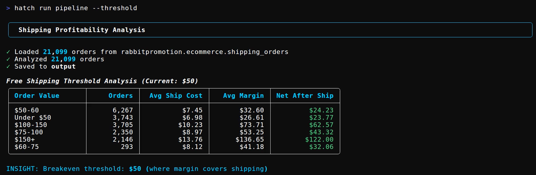
Nearly 20% of orders land in the $50-55 band. Only 7.4% land just under. The threshold is influencing behavior, customers add items to hit it. That's the point. But look at where margin lands across the order value bands:
Order Value    Orders    Avg Ship Cost    Avg Margin    Net After Ship
$50-60          6,267         $7.45          $32.60         $24.23
$60-75            293         $8.12          $41.18         $32.06
$75-100         2,350         $8.97          $53.25         $43.32
$100-150        3,705        $10.23          $73.71         $62.57
$150+           2,146        $13.76         $136.65        $122.00
The $50-60 band has the most orders and the lowest margin. The bands above it are 2-5x more profitable per order. The threshold pulls customers toward the exact order value where margin is thinnest.
What It Produces
The default view shows the shipping cost breakdown:
The --threshold flag shows profitability by order value band with breakeven calculation. The --orders flag breaks down unprofitable vs marginal vs profitable by shipping type. Five CSVs get saved to output/ for further analysis or BI import.
Getting Started
The playbook includes sample order data so results are visible immediately. To use real data, replace data/orders.csv with an order export or configure BigQuery in .env.
Clone the playbook and run:
This post is for paying subscribers only
Sign up now and upgrade your account to read the post and get access to the full library of posts for paying subscribers only.